Copilot Insights: The Art and Science Behind Our AI Visualizations
The digital media and advertising industry has witnessed an explosion of innovation that has embedded artificial intelligence across a suite of buying and measurement technologies.
While these developments have driven undeniable value for brands, we still get many questions about “what the AI is actually doing” or “why the technology made certain decisions.” Deconstructing machine learning and big data remains a formidable challenge in an industry where millions of buying decisions are made each second.
Recently, the Copilot team invested in bridging this divide to better answer “What is Copilot doing?” and other frequently asked questions for our clients.
Our Vision
In October of 2020 the Copilot team embarked on a journey of reimagining insights through the lens of machine learning and data visualization. It was important for our team to find innovative solutions to showcase the value of the Copilot decisions being made behind the scenes. With a team of Data Scientists, Engineers, and visualization experts, we looked at the common threads from which different algorithmic components derive decisions. Our goal was to compartmentalize the various ways campaigns are optimized and visualize them in artistic and relatable representations.
Our Challenge
The challenge was to communicate how an ad campaign performs and delivers and explain how our technology, Copilot, adds incremental value with machine learning optimization. Adding to the challenge, the project took place during COVID-19 and required collaboration across various teams during an extended period of remote working.
Our Method
To design Insights, we first connected with Copilot users across many countries to identify and organize pertinent campaign information and analytics. Through this process we discovered three key categories of questions that surface when running any Copilot campaign:
- What did Copilot do?
- How did Copilot perform?
- What can I learn about my audience?
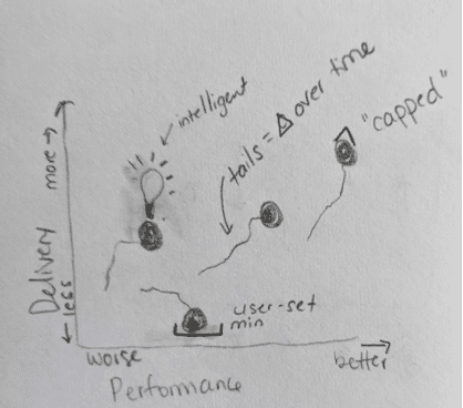
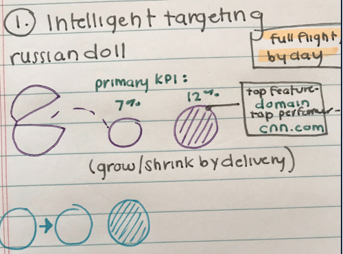
Next, our product and visualization teams organized “sketch parties” to engage a diverse group of experts and crowdsource hand-drawn ideas. Our own Katherine Mello walks through the processes and thinking behind this virtual brainstorm here.
Each sketch party presented a specific design challenge to the team and allowed them five minutes to sketch their ideas. After short presentations and discussions, those ideas were collated, evaluated, and merged into low fidelity mocks for further input from our users.
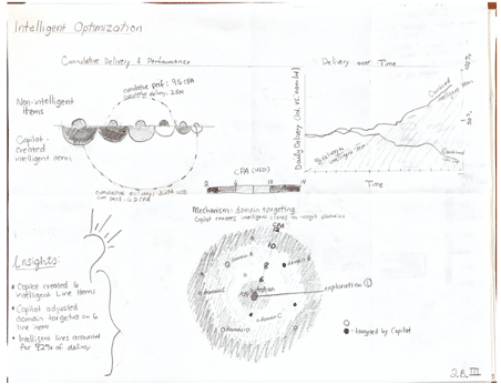
Copilot Sketch Party, examples from Data Science and Marketing
Through ongoing user interviews in Asia, Latin America, Europe, and North America, we refined those low fidelity mocks into high fidelity solutions. During this process we consolidated concepts such as the color scale that communicates goal performance on every slide and the widgets that actively translate data into human digestible language. Our aim was to make visual processing of the package more streamlined and understandable.
Low Fidelity Mocks, bringing ideas and concepts to life
The Result
Copilot Insights was launched in March, 2021. It provides an automated, in-depth analysis of every Copilot campaign. The package is available across all major DSPs to compare and contrast campaign performance in a unified view.
The Copilot Insight package contains ten bespoke views split across three sections:
- How a campaign performed.
- The optimization that took place.
- The characteristics of a campaign that drive performance.
Table of Contents, Copilot Insights

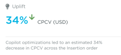
Machine learning is embedded in our analytics to predict potential uplift generated by individual optimization components. These models actively deconstruct Copilot optimization to estimate uplift on a given goal type. Uplift models are embedded in Copilot Insight visualizations and highlighted across the package.
Estimated Uplift in CPCV, Copilot Activation

After reviewing insights available in the industry, we concluded that similar analyses often lacked simple human interpretability. To improve the experience, we embedded widgets that translate data into simplified language and offer key takeaways in every view. The additional takeaways succinctly communicate salient campaign information and make it easier for our clients to digest and understand campaign management.
Example Widgets, Sites & Applications

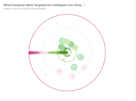
It was important for our design specialists to provide analyses in divergent, engaging, and aesthetic formats. By pulling together various analytics streams, we aimed to simplify the complexity of applying AI to media buying and audience targeting.
Copilot Targeting, analysis of features on Copilot campaigns

Copilot Insights can now be captured for all Campaign Level Strategies on Copilot. The entire process took six months of research, brainstorming, collaboration, and development, and yielded a service that we’re deeply proud to provide to our clients.