Brands know they need artificial intelligence, and their programmatic advertising partners know they would have a hard time working without it.
But as data volumes grow exponentially and AI speeds up its ability to process this data through machine learning, a glaring issue for marketers has been a lack of clarity in understanding how the AI is working. Marketers want to see where their money is being spent and why. Just saying that “AI optimized it” won’t cut it.
Data visualization can play a big role in helping to distill the complexity of multiple metrics and processes into a visually appealing presentation that can be quickly understood and then delved into for further detail. Our Copilot team, which develops proprietary technology at Xaxis, has been working to make AI more accessible for a few years. I’m tasked with translating our bespoke AI models into visualizations that provide insights for agencies and brands.
A good visualization communicates the truth in data, but which truth depends on what is being communicated, and to whom. To effectively design a visualization is to know the data intimately but, more important, to understand the needs of the audience it is speaking to. The audience of the visualization must be top of mind when designing.
For example, a visualization designer should consider:
- Does the data need to be shown over a period of time?
- Which metrics are most important?
- What areas of a visualization need to “pop”?
Building a Visualization, in Practice
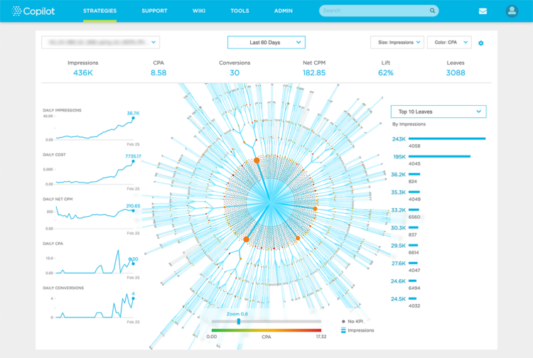
Recently, we launched some new data visualizations to explain one of our algorithmic strategies, showing masses of non-human decisions in an easily digestible and yet non-trivial way.

The graphic on this page captures a wealth of complex findings in a way a human being can quickly grasp: how the cost-per-action (CPA) of impressions purchased declined even as the number of impressions increased and their pricing (represented by CPM) was held relatively flat. You can see from the concentric circles how the AI was able to manage the process as the ad targeting moved from CPAs and limited KPIs to eventually home in and concentrate on impressions that were priced well and were effective.
Data visualization can be similar to traditional UX design practices. Both UX design and data visualization involve user research, modeling use cases, interviews with the intended audience, and many test layouts. Going through this process shows the designer what insights the audience is seeking and reveals questions that need to be answered by the design.
Data Visualization as Art
Despite protest from some within the data visualization community, I consider data visualization to be the art of the computer science world. The aesthetic aspect of design is an essential component of strong visualizations. Practitioners of data visualization should consider the artfulness of our work.
Being artful doesn't diminish the value of a visualization. Rather, it allows it to transcend the data and captivate the spirit. Doing so requires a deep focus on both highlighting the right data for a given audience and respecting the art of design.
Color choice, spacing, and movement should all be top of mind when working with data. Beautiful visualizations are comprised of numbers and formulas that inform shapes and colors.
There are great lengths to go to in order to further improve how we visualize the bounties that AI and machine learning can bring. A focus on both relevant data and aesthetics will ensure that this discipline will continue to bring tremendous value to marketers.


